Map of Iceland
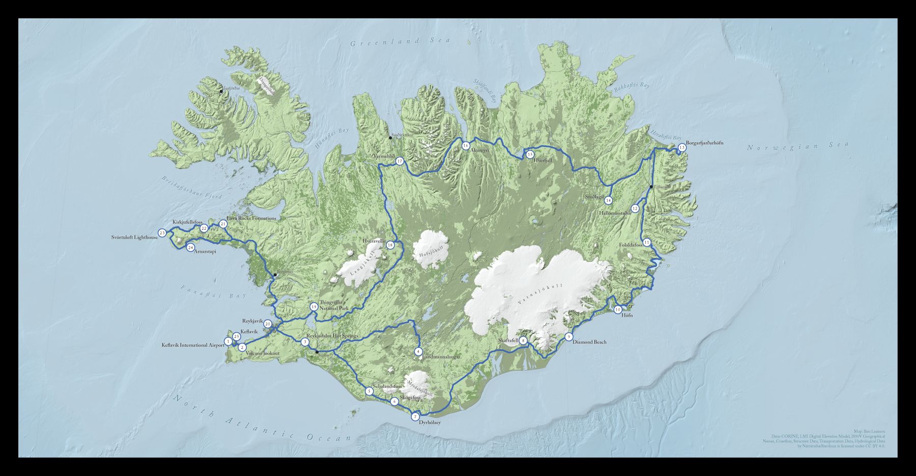
The initial brief was to help make a map that was better than the default one generated by the publishing software he was using, which was ok, but I was pretty sure I could do better.
I downloaded almost all of the data for this map from the Náttúrufræðistofnun, or Natural Science Institute of Iceland. It was nice to have all the information I might need in once place, although English localization, especially in the metadata, was spotty. After some Google Translating and some internet research however, I was able to get the layers I wanted. (You should have a look at their map viewer if you have a moment. How cool is it that you can get seal habitats and the locations of Icelandic sagas all in one place?)
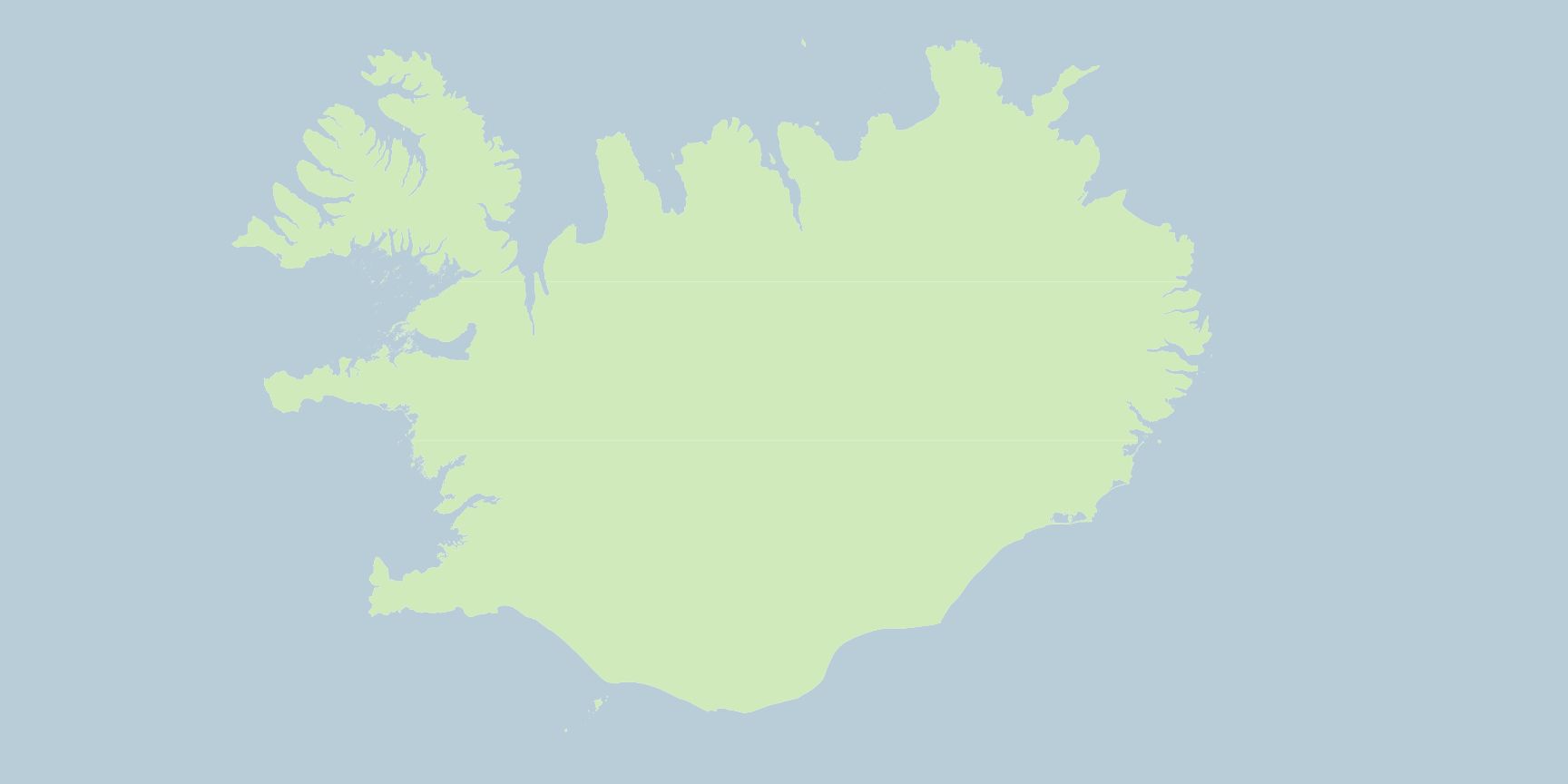
To get started I imported a simple outline of the country, and then reversed the symbol to make an ocean polygon. I like doing this when there's a possibility future data layers will have some tiny gaps between them. Obviously that wouldn't be good if the data was being used for analysis, but for my purposes, it was ok.
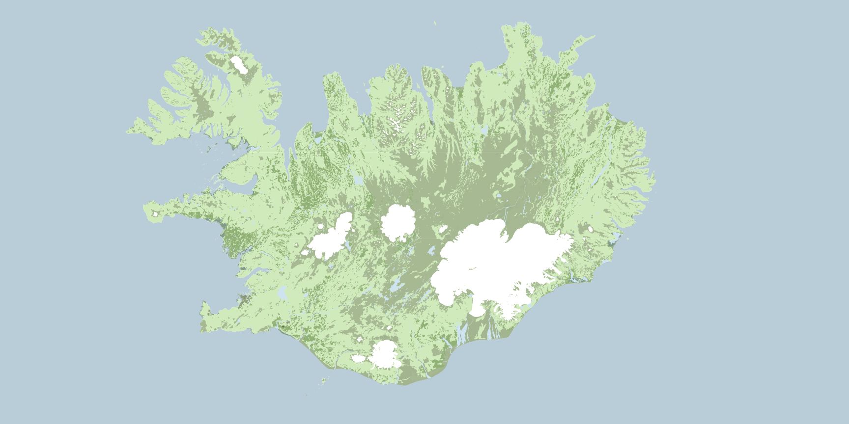
I wanted the basemap to feature a subtle land cover, so I downloaded more data from the Náttúrufræðistofnun, and extracted layers for wooded land, glaciers and snow, sand, bare rock, and water. I also added a layer containing human-made structures.
Daniel Huffman is an amazing cartographer, and I relied on his article on terrain in photoshop as inspiration for the style of the basemap. I was trying to do as much work as possible in QGIS, so the process isn't exactly the same, but the basics hold. Layering terrain layers on top of each other, then using blend modes to mix the colors. Except for the glaciers and water, most of these layers were blended using multiply at around 80% opacity, but I'd highly encourage you to mess around with blend modes on your own and see what looks good!
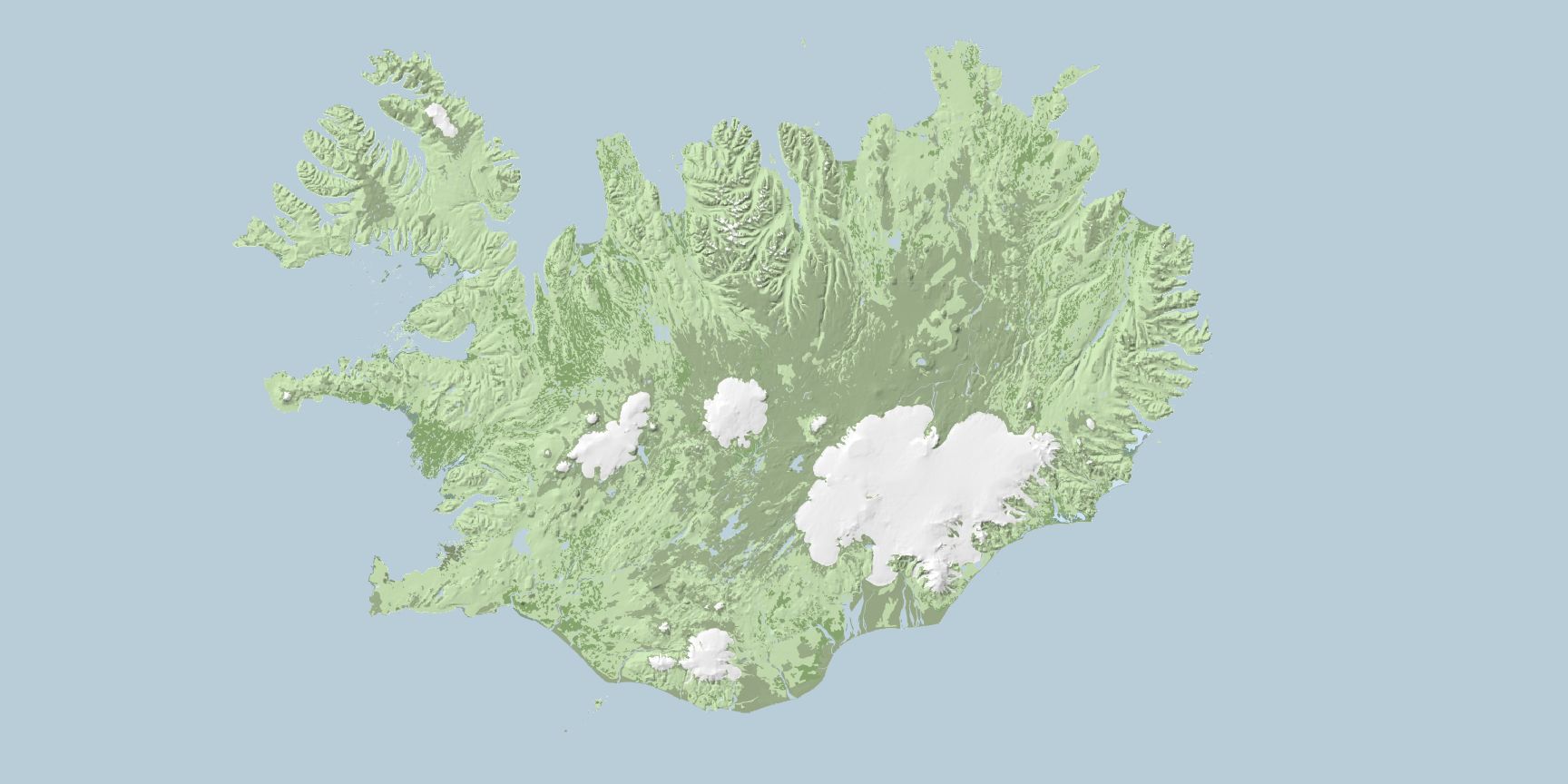
On top of these layers I added a hillshade layer, blended using multiply at 55% opacity to give a sense of the natural contours of the land, without being overpowering. If I hadn't been trying to do as much of this as possible using QGIS, this hillshade layer would have been a good time to use Blender, but I think the effect worked well enough as is.
Now for some small tweaks that make the map look better.
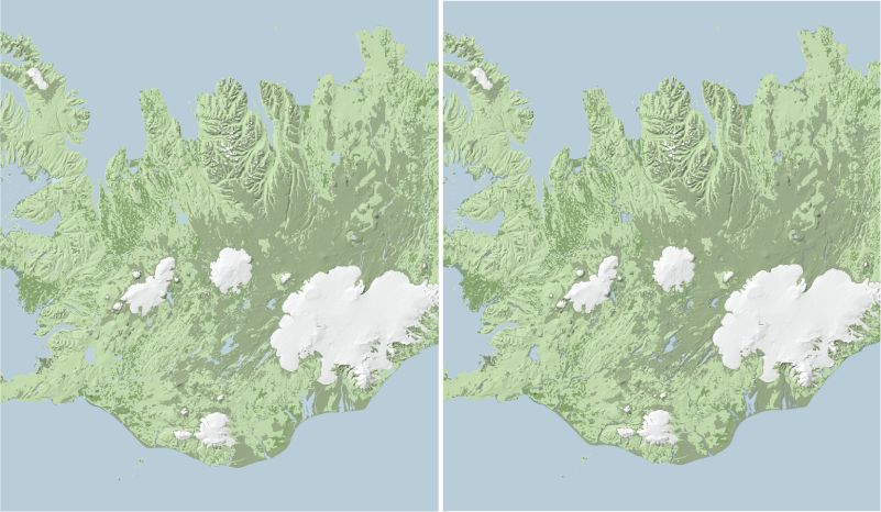
I copied the water layer, and using QGIS's effects properties, added an inner shadow. This gives a slight dimensionality to the water features, recessing them within the landscape.
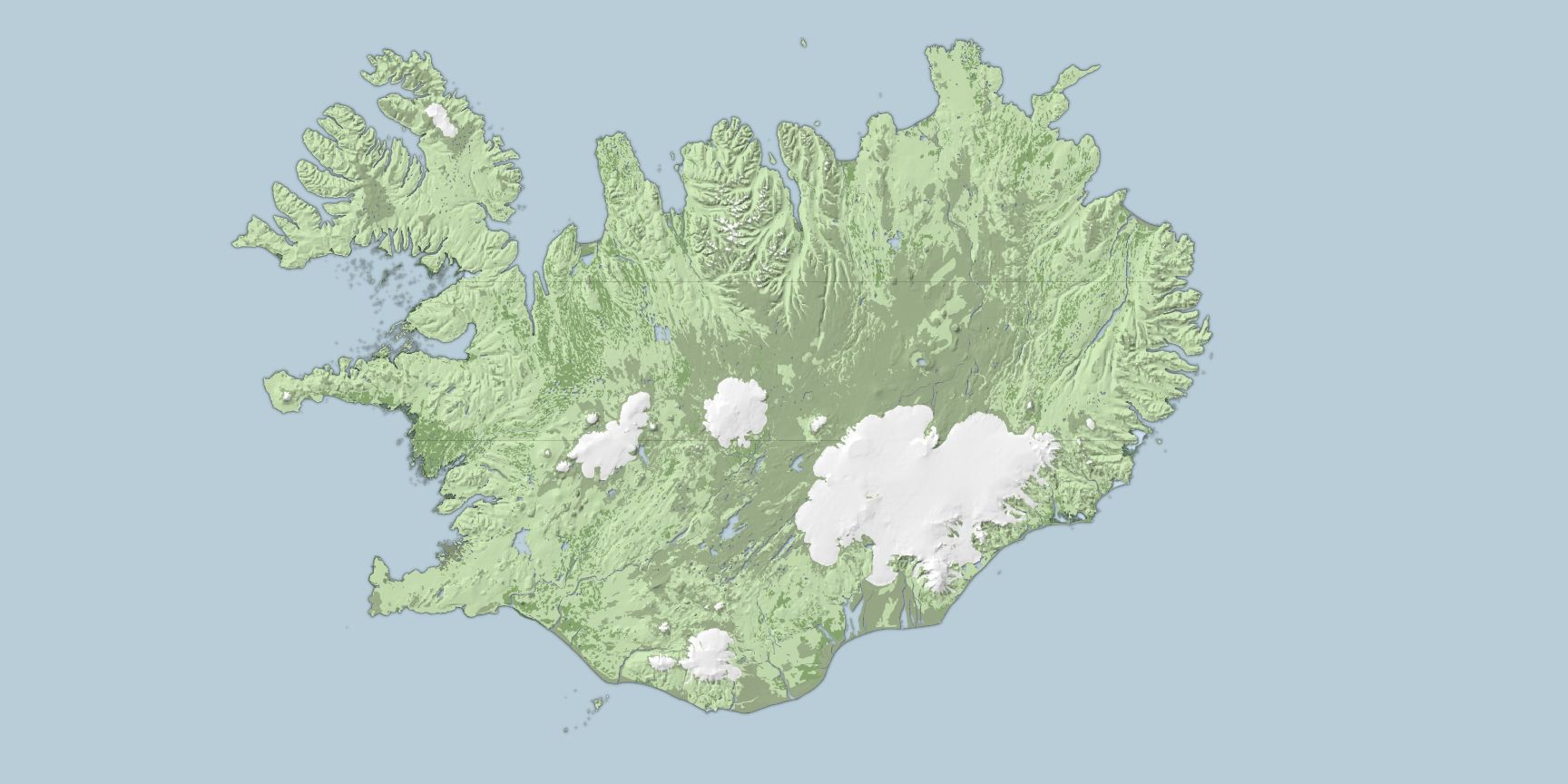
I also did the same with the land layer, duplicating it and using effects properties -- this time with an outer glow -- to add a slight shadow on the outline of the coastline. I think both of these effects improve contrast and highlight small features that would otherwise be harder to see.
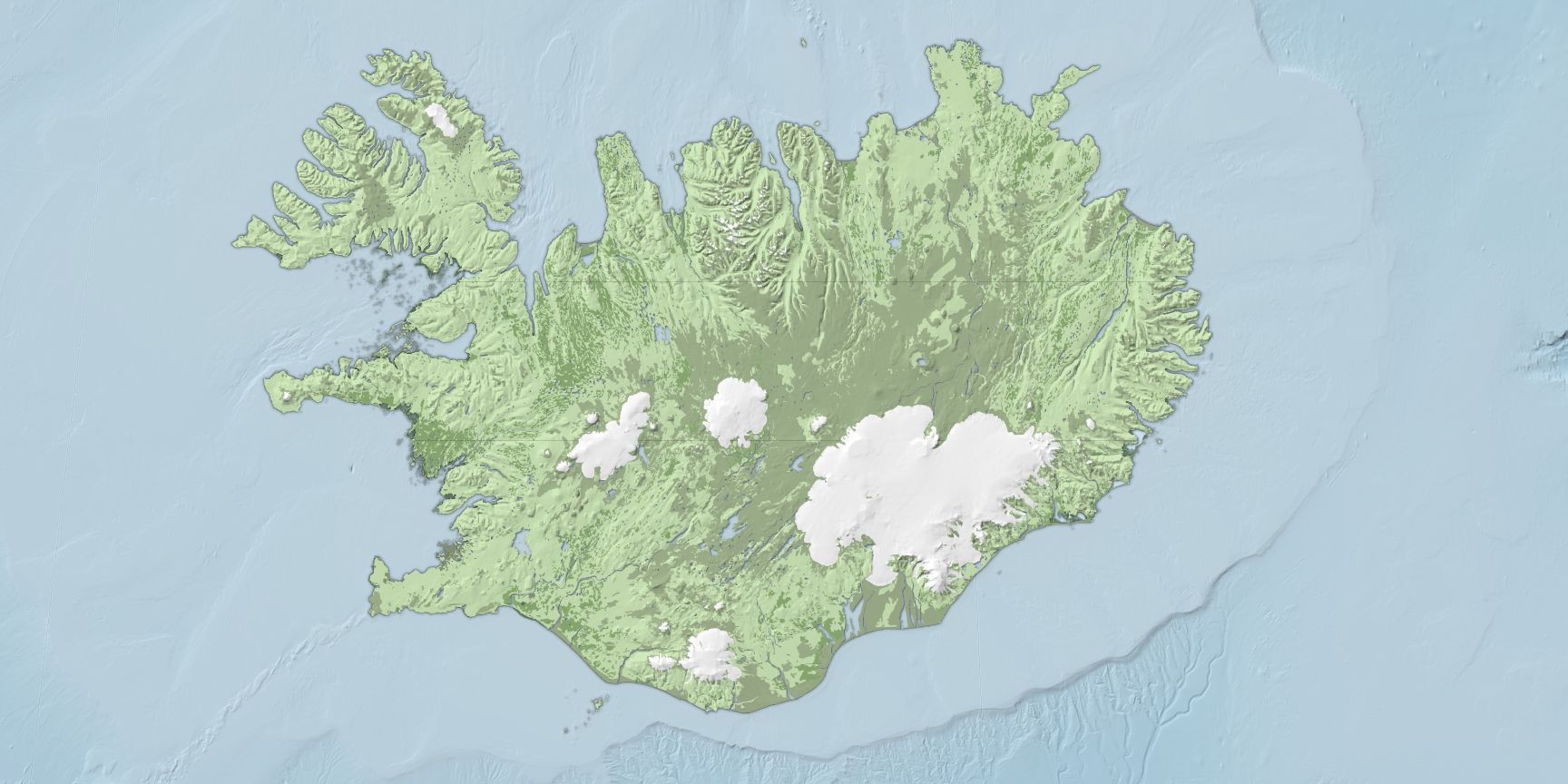
Finally I went back and added a bathymetry DEM, first styled as a color ramp, and then styled as a hillshade (this layer top of the color ramp, again using the multiply blend mode to mix the topography and the color). This shows the contours of the ocean floor.
At this point the deadline for the album was fast-approaching, as was my move to a new apartment. While I had hoped to finish everything in QGIS, it was ultimately faster to at this point switch to Illustrator for the labeling and final adjustments. I exported the basemap as a single image, as well as labels for cities, natural features, and the itinerary of the trip I was commemorating.
I used many of the same Illustrator tricks that I used on my world map, again thanks to Daniel Huffman's amazing blog, to make the labels stand out from the background.
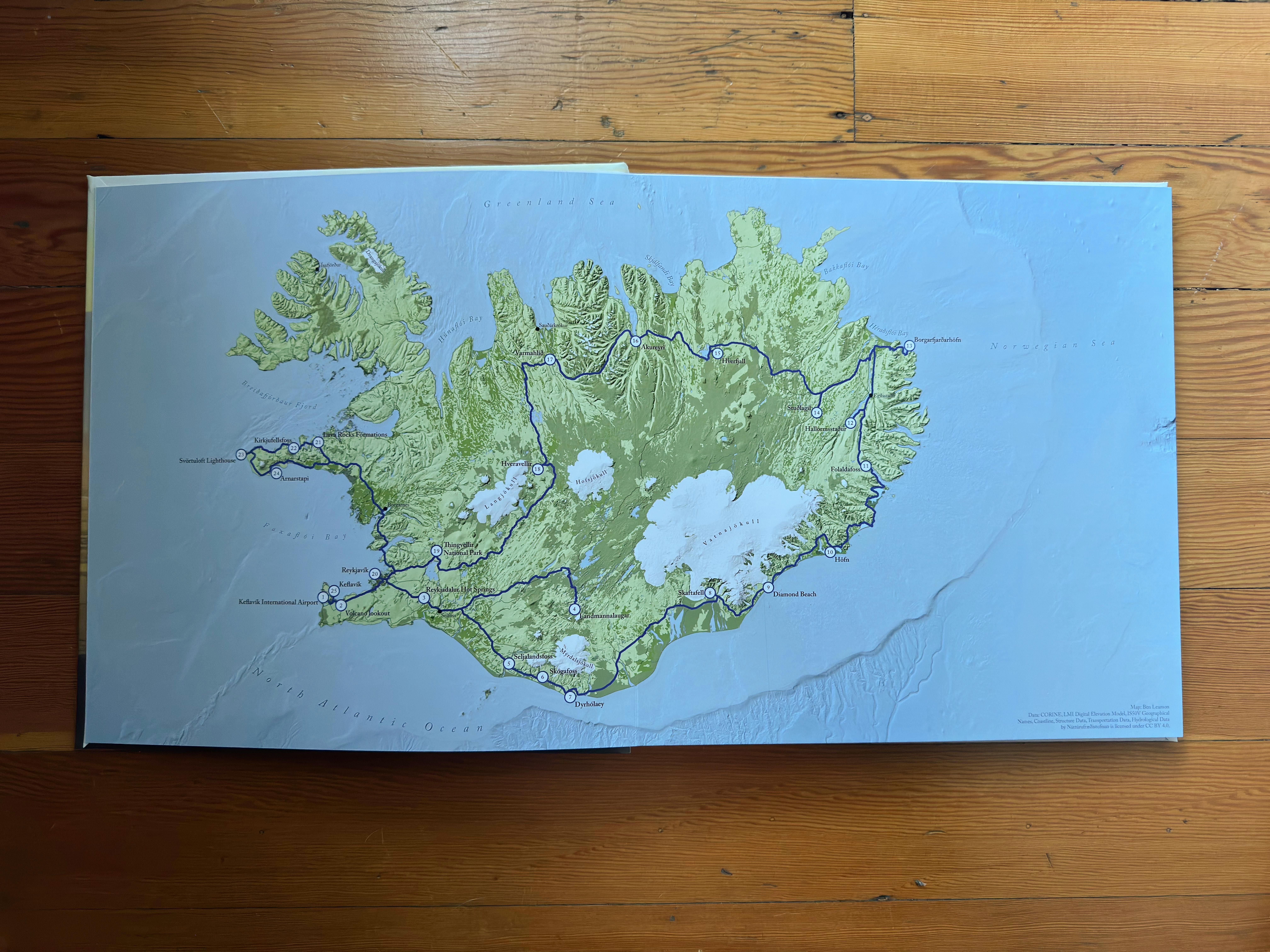
It's pretty magical seeing something you made printed out and bound, and it was great being able to contribute to the book my friend was making! If anyone reading this is interested in having a map made -- let me know and we can work something out!