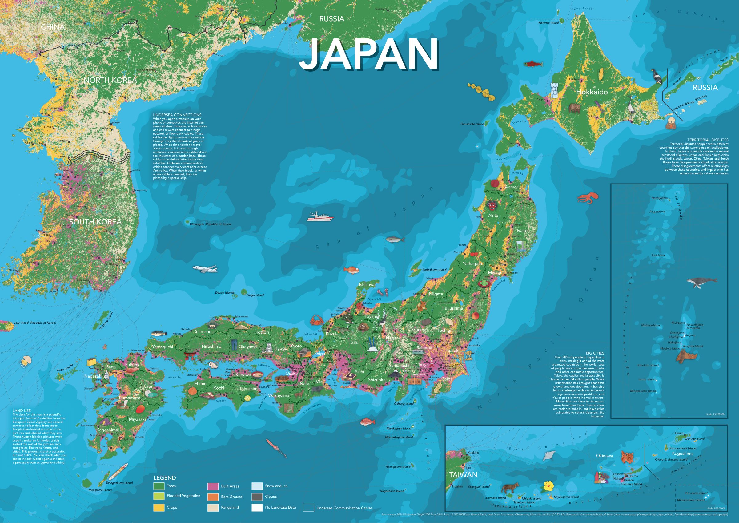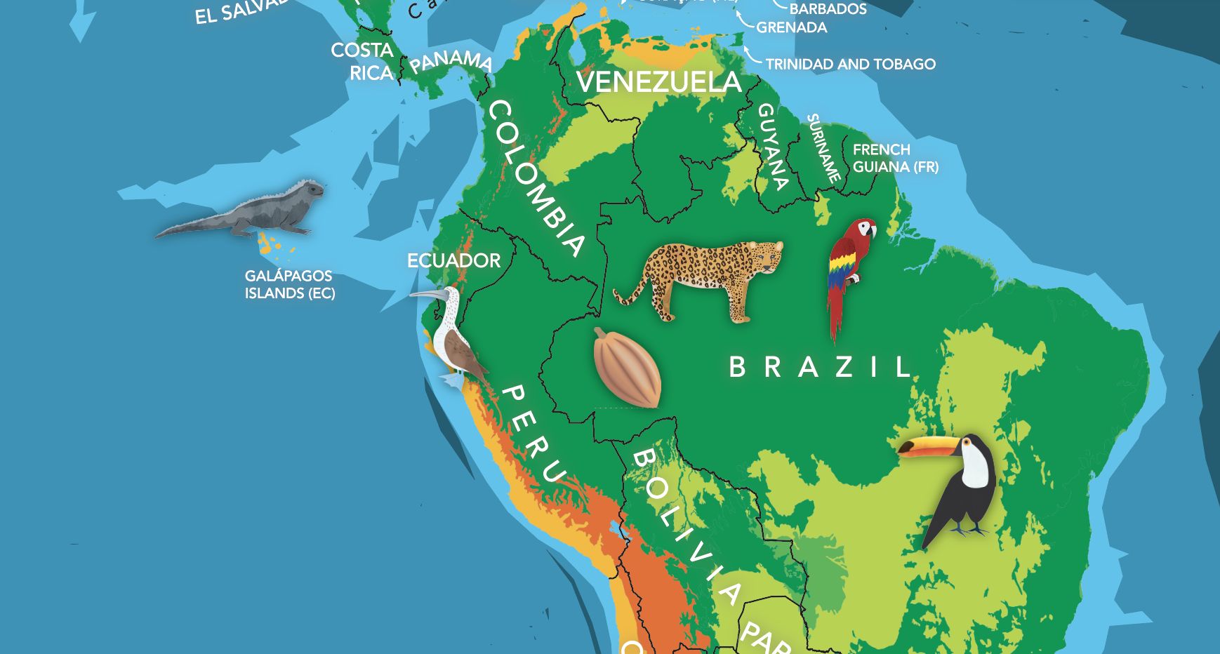
For the third (and possibly final) in my series of illustrated maps for kids, I made a map of Japan. As always, the map includes plenty of hand-drawn illustrations, prefectural and city labels, and info panels for more detail.
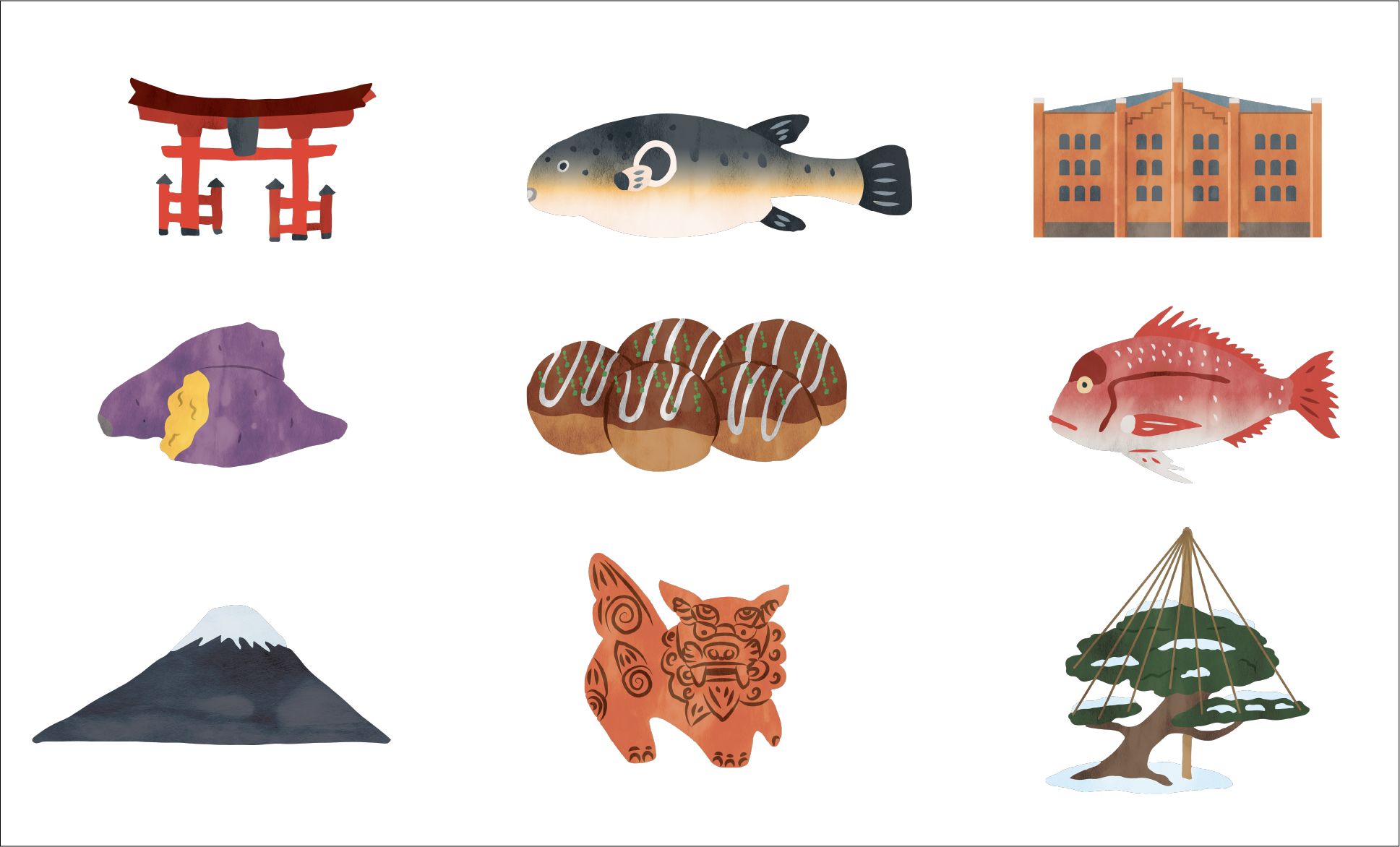
Some of the illustrations I made for the map.
If you're interested in getting a copy of the map, please email me and we'll figure something out. If you're interested in the map-making process, read on!
This is the fourth iteration of this site. I'm not exactly sure, but I think I'm coming up on roughly six years of having this thing online. When I was writing the first version, hand-coding everything in HTML and CSS, Game of Thrones was still on TV. While I don't think I'd design it the same today, I was pretty pleased with it at the time.
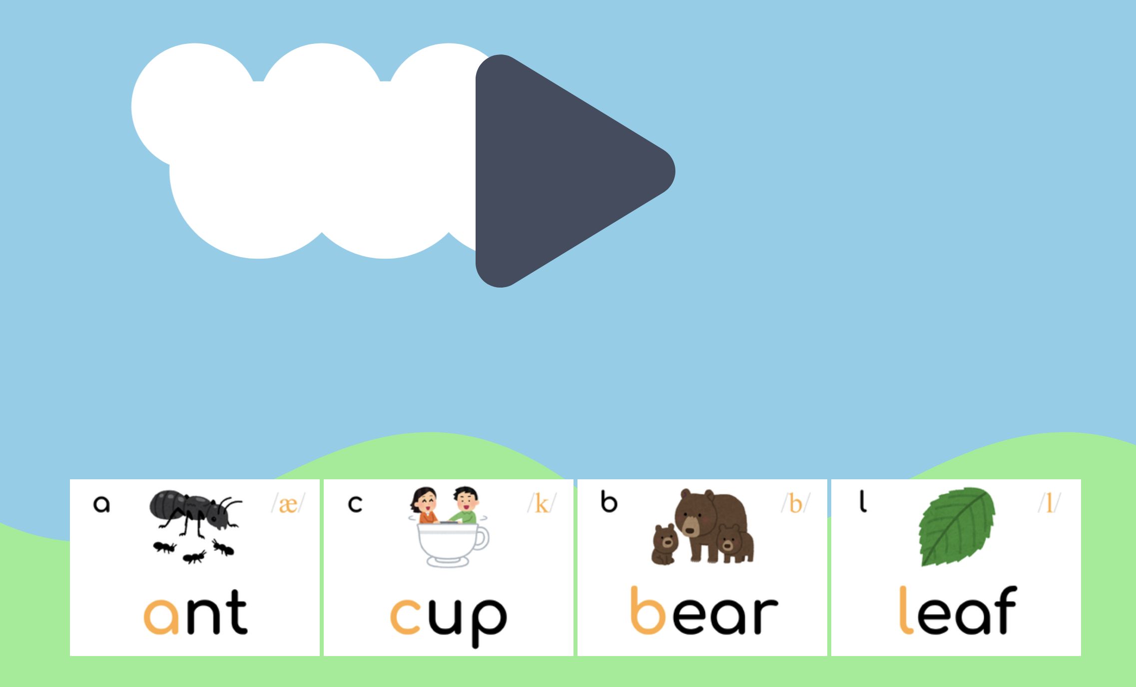
Lots of the kids in my class have trouble learning phonics, and for good reason! It’s not an easy skill to learn, and can be difficult to practice without someone on hand to correct pronunciation. Meanwhile learning phonics is (as far as I know) the best way to learn how to read which is (as far as I know) one of the most fulfilling things a person can do with their day.
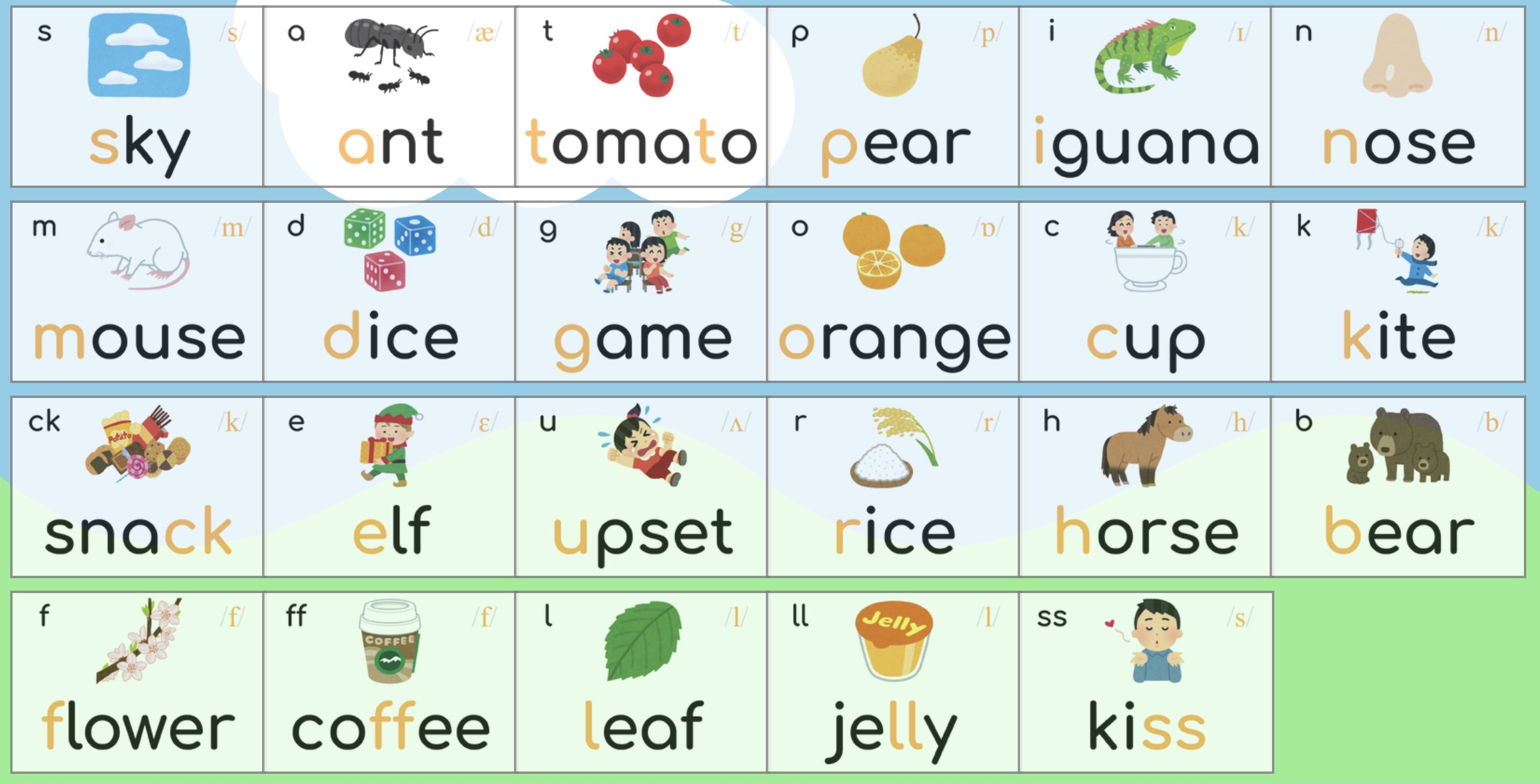
To help my students practice at home, I made a website where they can click on a phoneme and listen to the pronunciation.
Additionally, added a quiz mode that will play a sound, and allow them to click on the corresponding card.
A bit over a year after completing my world map, I’ve finished a map of the United States. In the same style as the world map, it features important cities, rivers, lakes, and ecoregions. Decorated with over 75 handmade illustrations depicting significant plants, animals, cultural and historical events, this map showcases some of what makes the US a unique and interesting place.
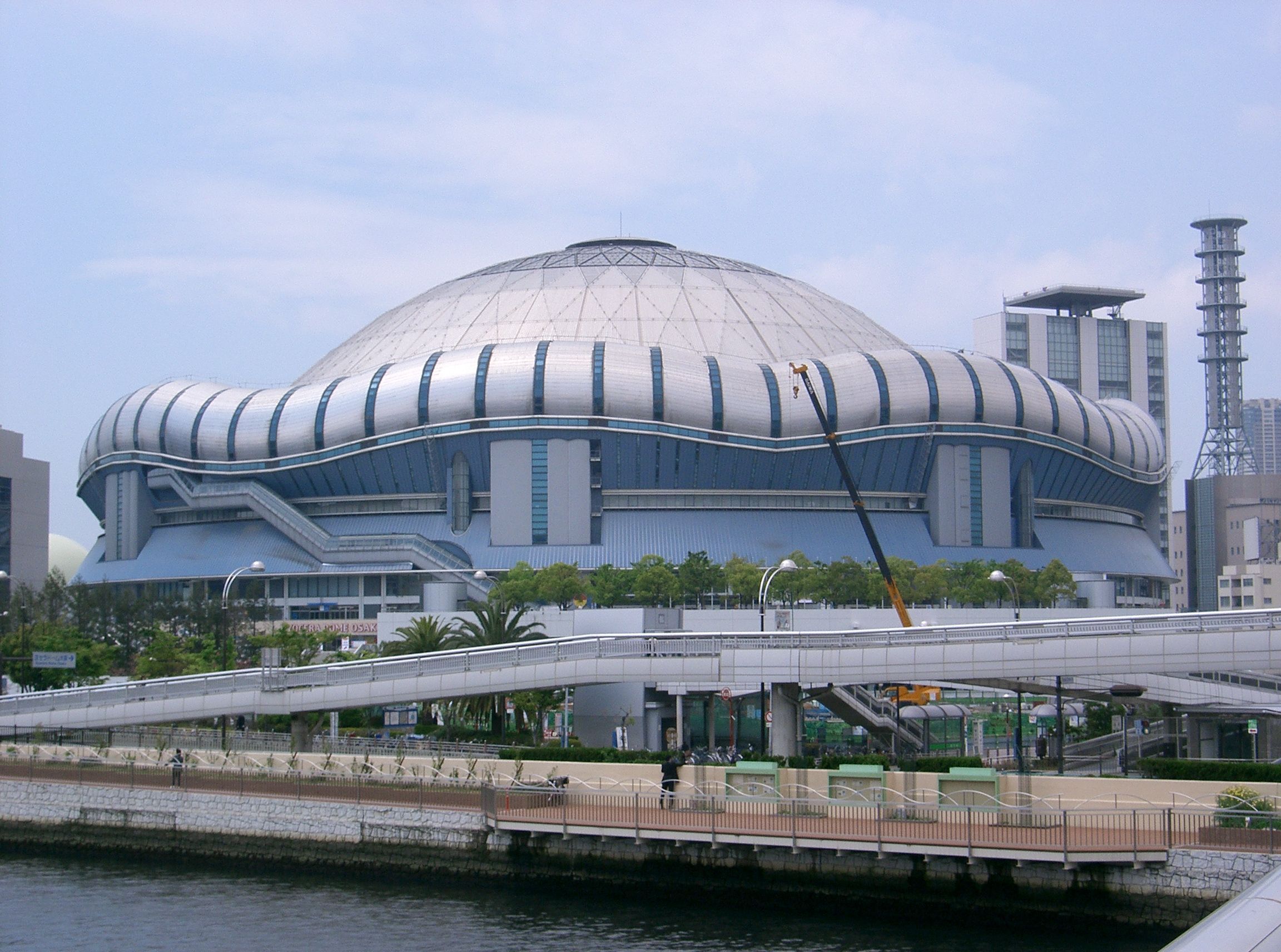
My neighborhood is a great place to live. A great place, that is, until a concert or baseball game finishes at Kyocera Dome and the streets, restaurants, and grocery stores are flooded by rivers of people.
In an attempt to combat this issue, I wrote a Google Apps Script that will scrape the Kyocera Dome monthly schedule and create google calendar events for each event. At least this way I can try to avoid going to the supermarket when I know it’s going to be a problem.
I’ve definitely done more useful things with programming, but this was deeply, deeply satisfying. If, for some reason, you also have a problem with Kyocera Dome and want to subscribe to the calendar, you can find it here.
If you happen to live near an arena and want to write your own version, you can find the code on my github.
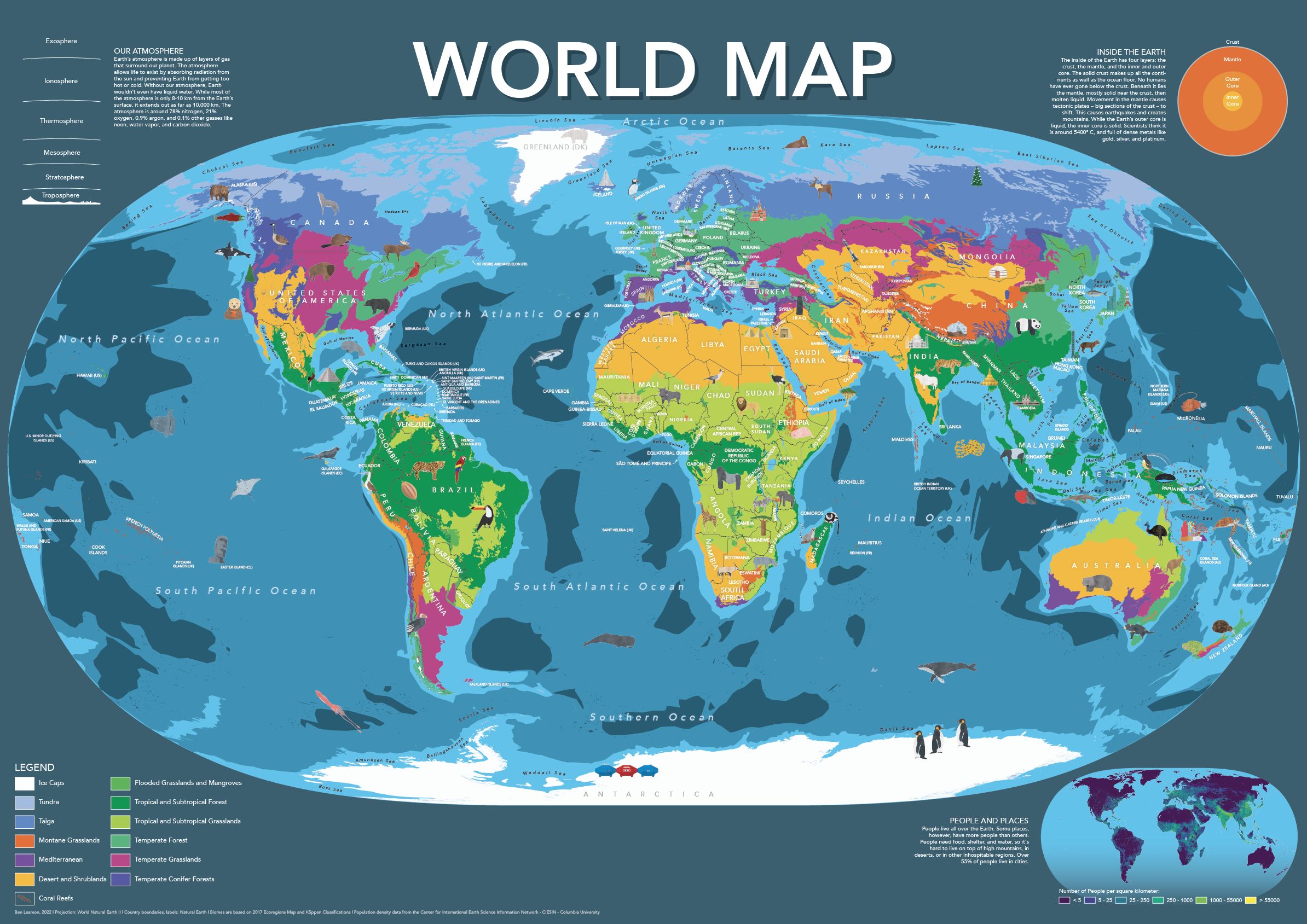
I made this world map for kids (or adults!) who want a playful, friendly, world map.
The map includes hand-placed labels for countries, overseas territories, as well as oceans and seas. Additionally, the map features nearly a hundred hand-drawn illustrations showcasing some of the most amazing plants, animals, and cultural accomplishments from around the world.
The base-map features climate zones, providing a clear and easy-to-understand visual representation of our planet’s diverse climates. Furthermore, the map includes informative panels on earth’s population, atmosphere, and core, making it a great educational tool as well.
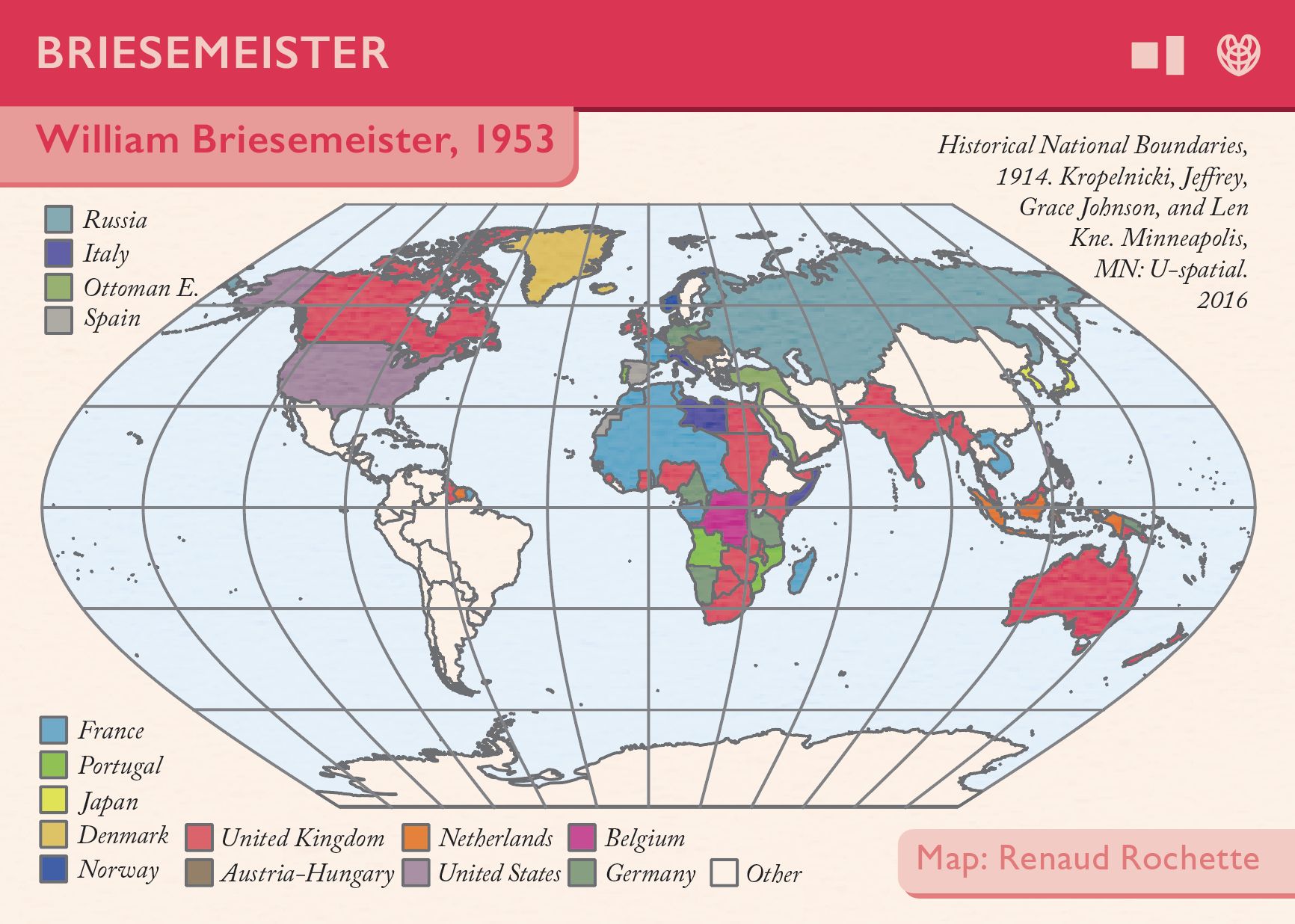
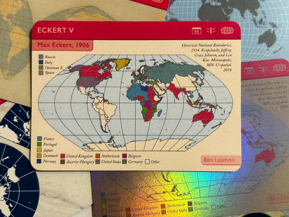
This is my contribution to Daniel Huffman’s projection cards project. My projection, Eckert V, isn’t recommended for use anymore, and was introduced in 1906. I thought it would be interesting to try and portray the world as it was when Eckert V was first released, with much of the world divided up between global empires. That data came from the University of Minnesota’s Historical National Boundaries dataset, which the authors very kindly granted me permission to use.
It was so much fun being part of a larger project, and thrilling to get a copy of my final card in the mail!
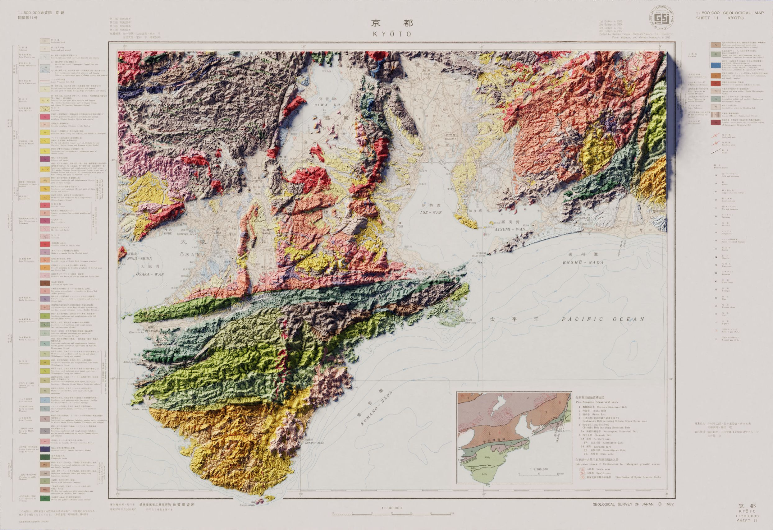
This is the first time I made in Blender using non-USGS data. The vintage map as well as the digital elevation model was readily available from the Geospatial Information Authority of Japan, but getting the data into a usable format was a bit of an adventure.
I haven’t done a full-size render of this one yet, so it might be a tiny bit fuzzy, but the key elements are all there!
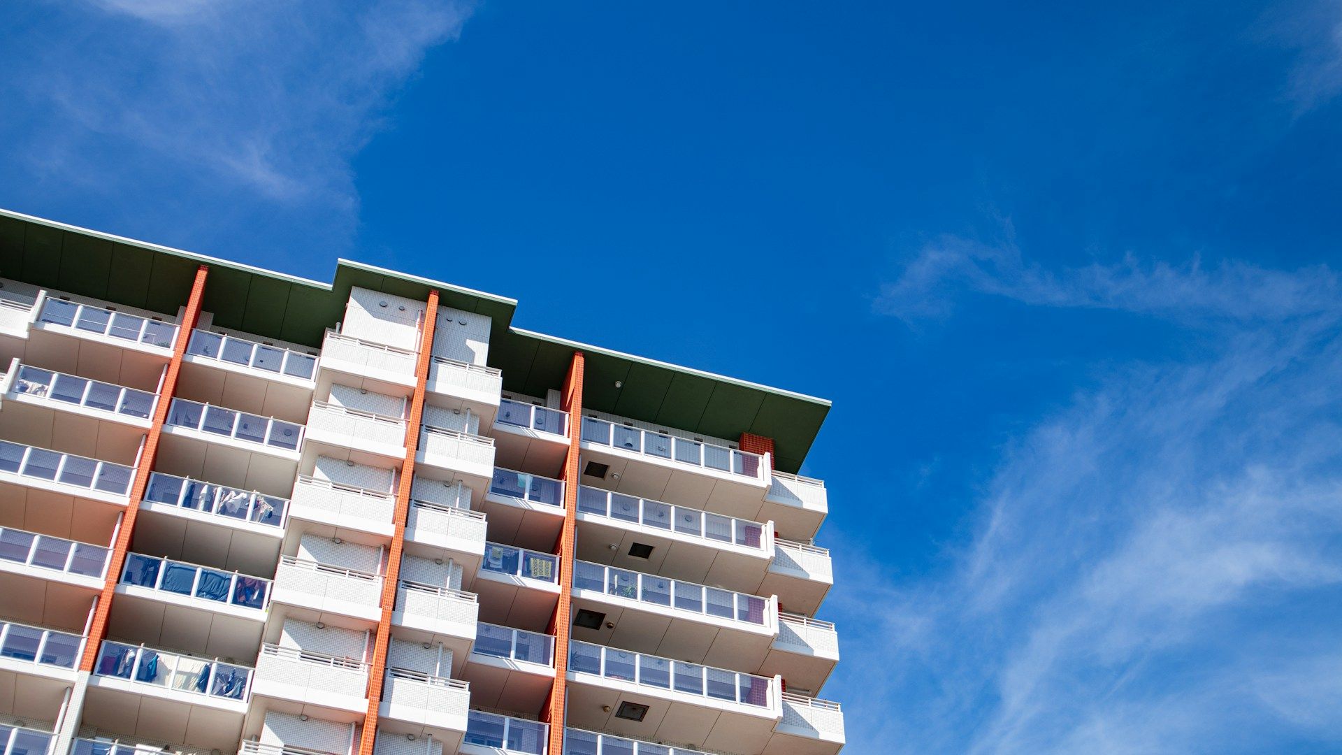
Good apartments can be hard to come by in Osaka, and one of my friends had his eye on a specific unit that he knew was about to be put on the market. The only catch was that applications are handled on a first-come first-served basis, and his job wasn’t compatible with constantly refreshing the housing company’s homepage.
I wrote this web scraper in python to check available units against a list of desirable units, and send an email when a new listing appeared. Time was of the essence so the code is probably less elegant than it could be, but it worked!
While I would deeply, deeply love to report otherwise, a 2011 Macbook air is not the computer to use if you want to layer modern hillshades with vintage maps in Blender. After many fruitless hours trying, this is my best shot using QGIS alone.
I’m not entirely satisfied with the results. They’re a far cry from the soft light and gentle shadows I had been hoping for. Still, I think the results are decent given that everything was done in QGIS. You can read the full write-up for this project here.
John Nelson makes some amazing tutorials and how-to videos for ArcGIS. While I love ArcGIS, I wanted to see how close I could get using the free and open-source QGIS. For anyone looking to learn more about QGIS, I’d highly recommend this approach. The steps are sometimes fairly different, so it’s a great way to get to know the software.
I see this process as honing my aesthetic sense for what works on the page, as well as expanding my technical knowledge. It’s also good in that it gives you a project, and a rough set of ideas for how to proceed, but you can’t fall back on following a written list of instructions. You really have to do some research and figure out how to get QGIS to do what you want.
Occasionally I’ve had to start in QGIS before moving to Illustrator, and some of the tutorials have been flat out impossible given the differences in the programs, but it’s a great way to practice making visually-appealing maps, learn more about cartography, and push the limits of what QGIS can do.
I haven’t made step-by-step instructions for these maps the way John Nelson has, but if you have any questions, feel free to reach out and I’ll see what I can do to help.
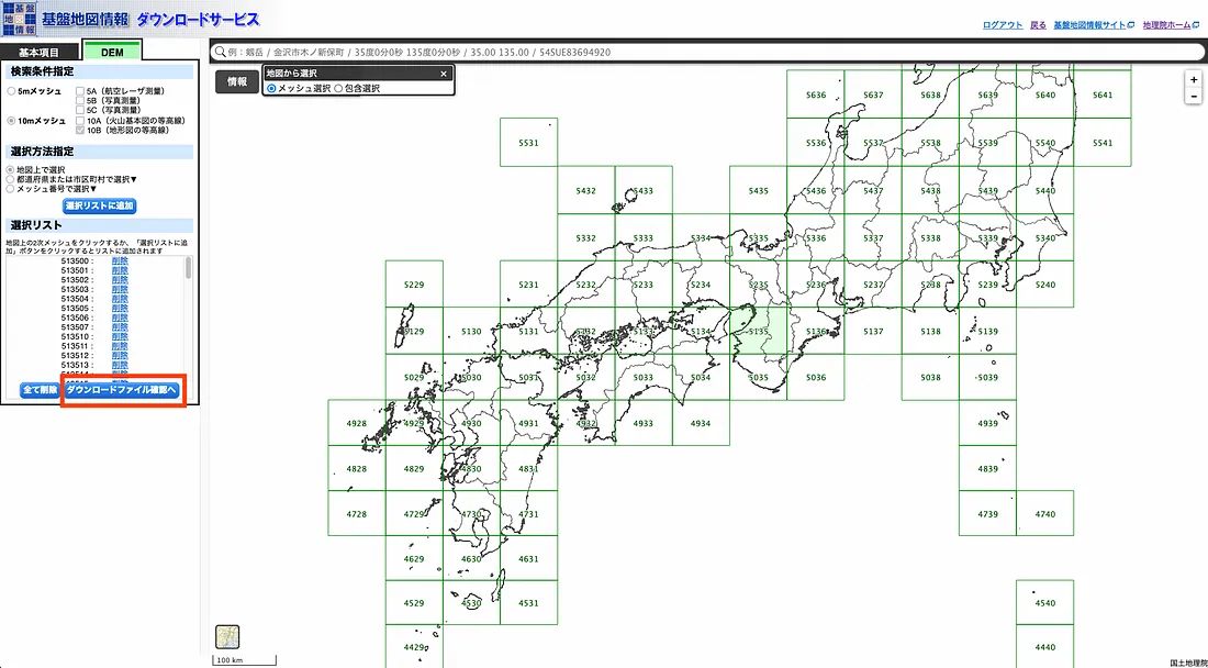
The Geospatial Authority of Japan offers some of the best DEMs of Japan I’ve been able to find. (If you have tips for any others, please let me know!) That said, the website and download process is not as straightforward as what I’m used to from the USGS, and for people hoping to use the data in QGIS or other GIS programs, the data needs a significant amount of processing to get it into a format you can use. If you’re looking DEMs of Japan however, they seem to be the best game in town. Here’s how to get what you need.
To download the DEMs you’ll need to go to the geospatial information authority’s website (https://fgd.gsi.go.jp/download/menu.php). You’ll need to create an account, and sign in. I created my account a while ago, and don’t remember the exact details, but Google Chrome will automatically translate the pages for you if you don’t read Japanese, so you should be able to get on well enough.
After you provide them with your personal information, they’ll send you an email with your username and password (in plain text, in the body of the email). After spending a couple minutes thinking about that, you can use those credentials to sign in.
Next, chose the resolution you’re after, and the area you’re interested in- in that order. Once you make a tile selection they won’t let you change resolutions.
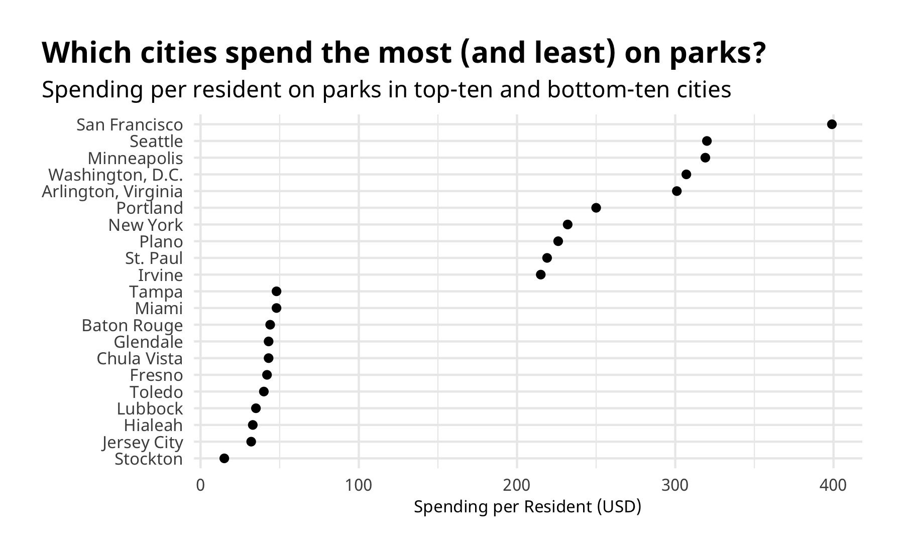
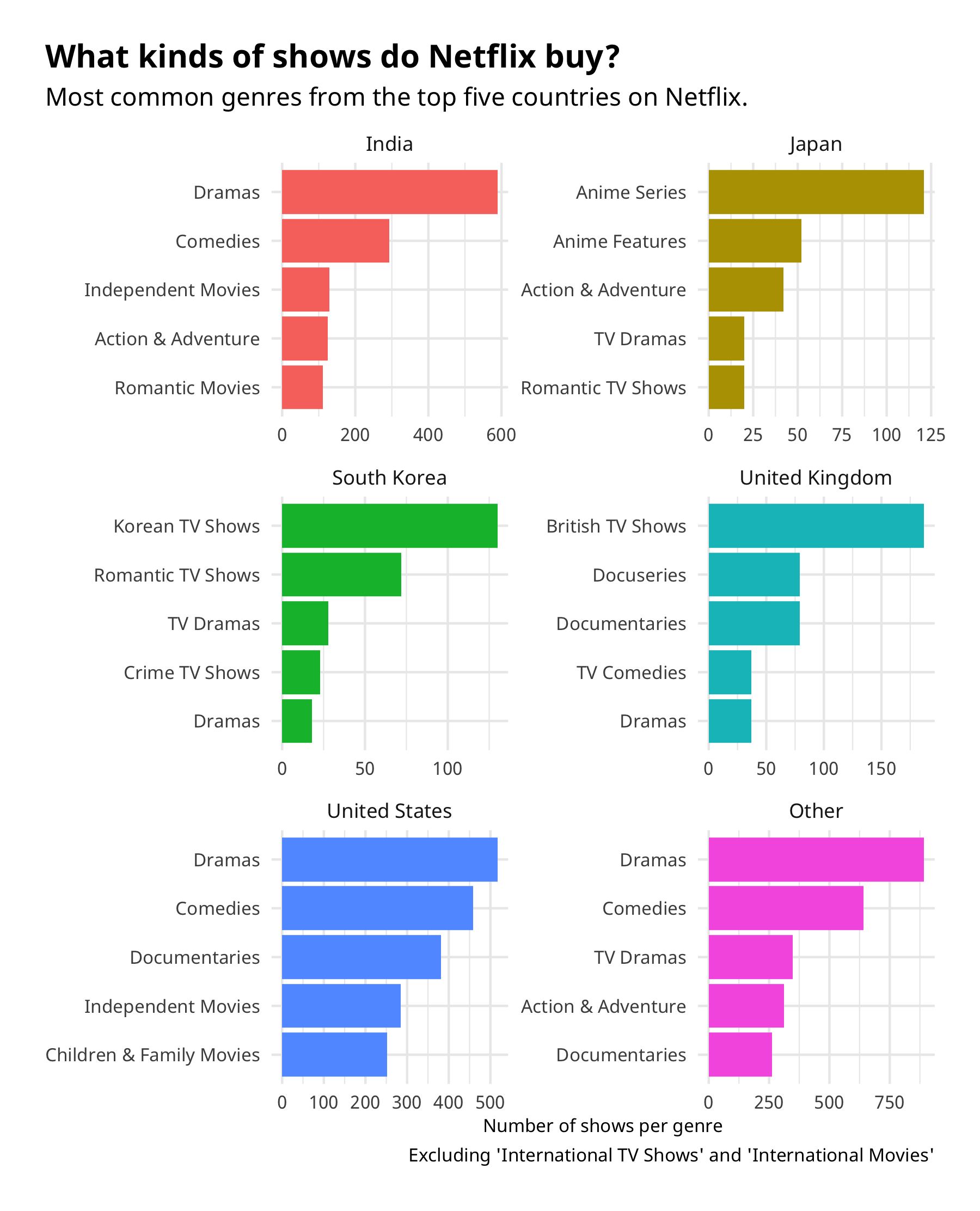
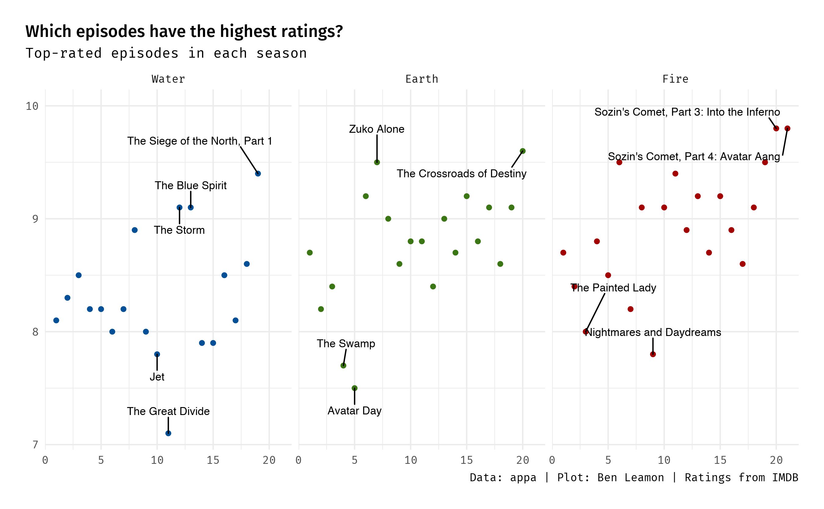
To continue practicing and improving my R and ggplot programming skills, I occasionally contribute to the Tidy Tuesday programming challenge. If you’d like to see the graphs, or check out the accompanying code, feel free to [check it out on GitHub]https://github.com/benleamon/tidy-tuesday).
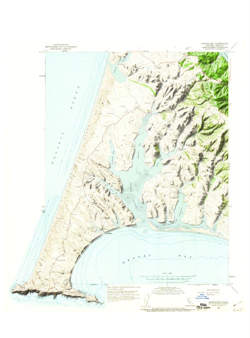
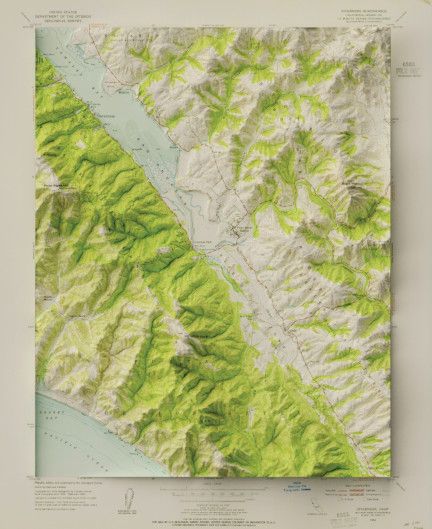
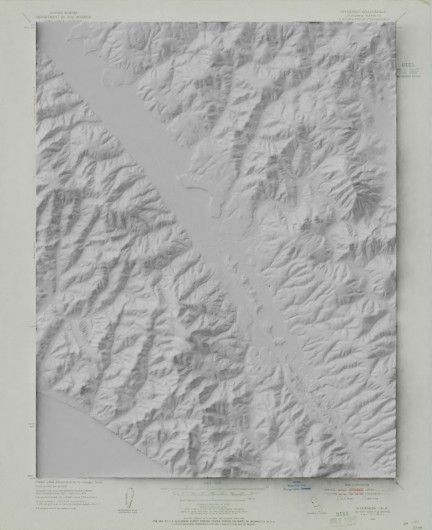
Several years ago I (and a lot of the internet) was very taken with Daniel Huffman’s techniques for creating hillshade in Blender, and the subsequent explosion of modern hillsahde imagery layered with vintage maps. After getting a new computer and basking in the increased processing power, I was able to make some pretty significant improvements on my original attempt in QGIS.
I stared with a USGS topo map, o which I added the hill-shade.
Which I then colored with the original map. I’m really pleased with the level of detail, even close up. Here is Point Reyes station and the surrounding hills.
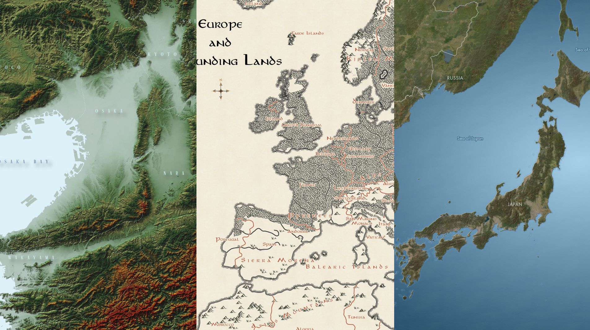
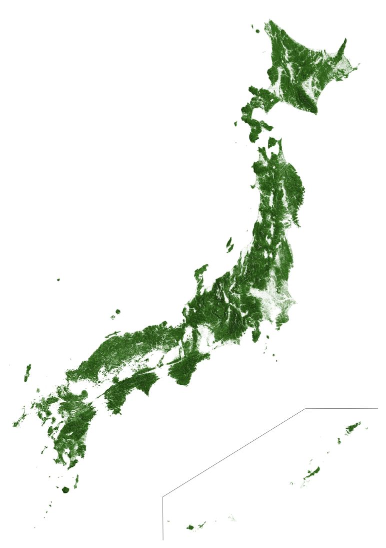
While working on a different project, I came across these maps of forested land in the US, Australia, and Europe, from Earth Art Australia. I was at a bit of a roadblock in my other project, and making a map of forested land in Japan seemed like an interesting — and most importantly easy— diversion. The project, however, quickly spiraled into interminable raster-processing on my aging macbook air.
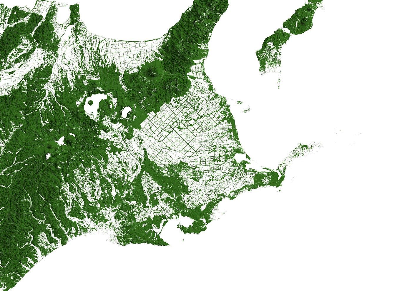
Highlights:
Compared to the maps of The US and Australia, the forests mapped closely to hills and mountains. North-Eastern Hokkaido, around Nakashibetsu, was interesting. Grids of agricultural fields are bordered by stands of trees.
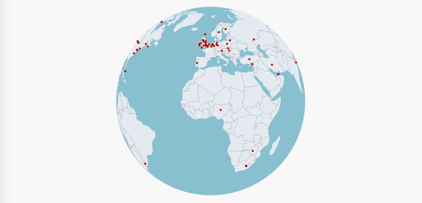
One of the podcasts I listen to, The Modern Mann, features honorary “Mannbassadors”, patrons of the show who represent their various locales. I made an interactive 3D map of all the Mannbassadors over the years, written in D3.JS.
As I was working on the project, the host, Ollie Mann, mentioned that he was looking for a map. My map was one of several submissions, and was ultimately chosen to be featured on his site.
You can see the full map on the podcast's website or here
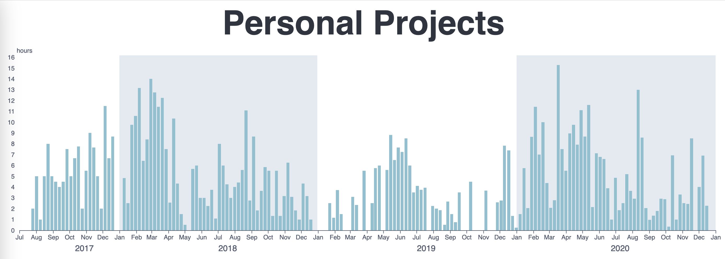
Since 2017 I’ve been keeping track (roughly) of how much time I spend working on personal projects. I got the idea from Cal Newport’s book, Deep Work, and it’s been really useful. Keeping track of how long I work helps keep me motivated as well as honest about how hard I’m working. It’s also good to know how my projects actually take.
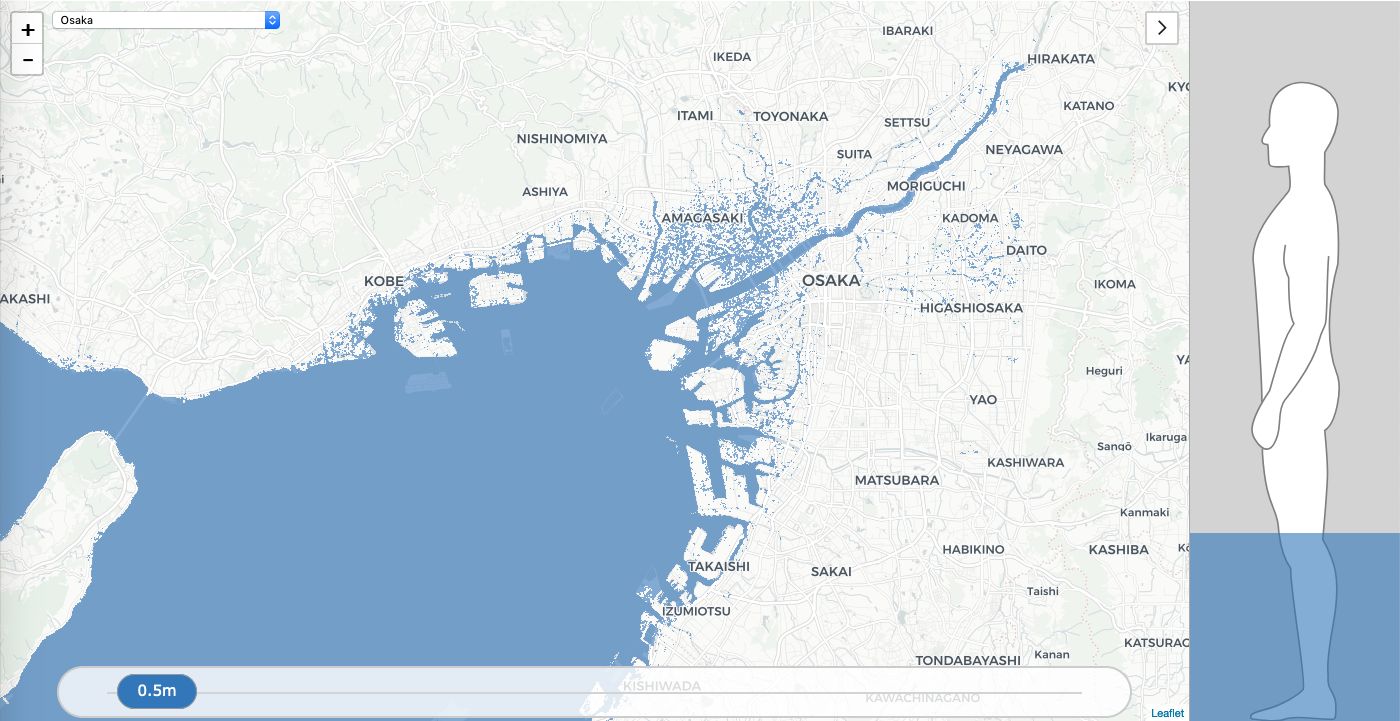
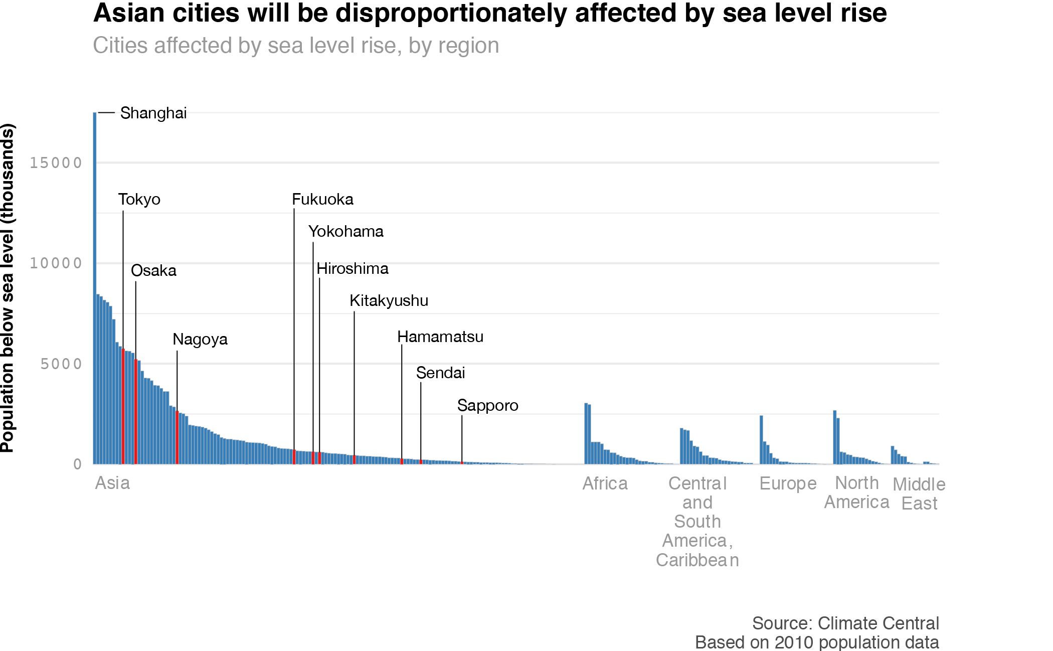
In 2018, I wanted to create a long-form infographic similar to those found online and in magazines. At the same time, I wanted to refresh my knowledge of HTML, CSS, and Javascript, which I hadn’t used since college, and learn how to create interactive web maps and graphs using R.
I think I bit off more than I could chew, and the project ended up taking much longer than I anticipated. Still, I’m proud that I could teach myself these skills during my breaks at work.
Throughout the project, I used a variety of tools, including HTML, CSS, Javascript, Leaflet.js, ggplot, and Illustrator.
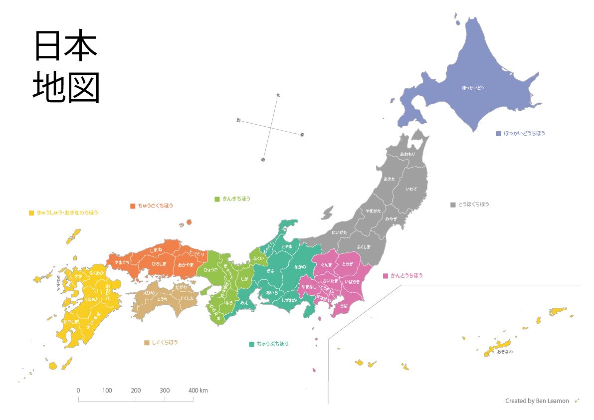
This is a simple map of Japan that I made in 2017 to get into the swing of things with QGIS and practice styling a simple QGIS map in Illustrator. If you’d like a copy, feel free to download and print it!
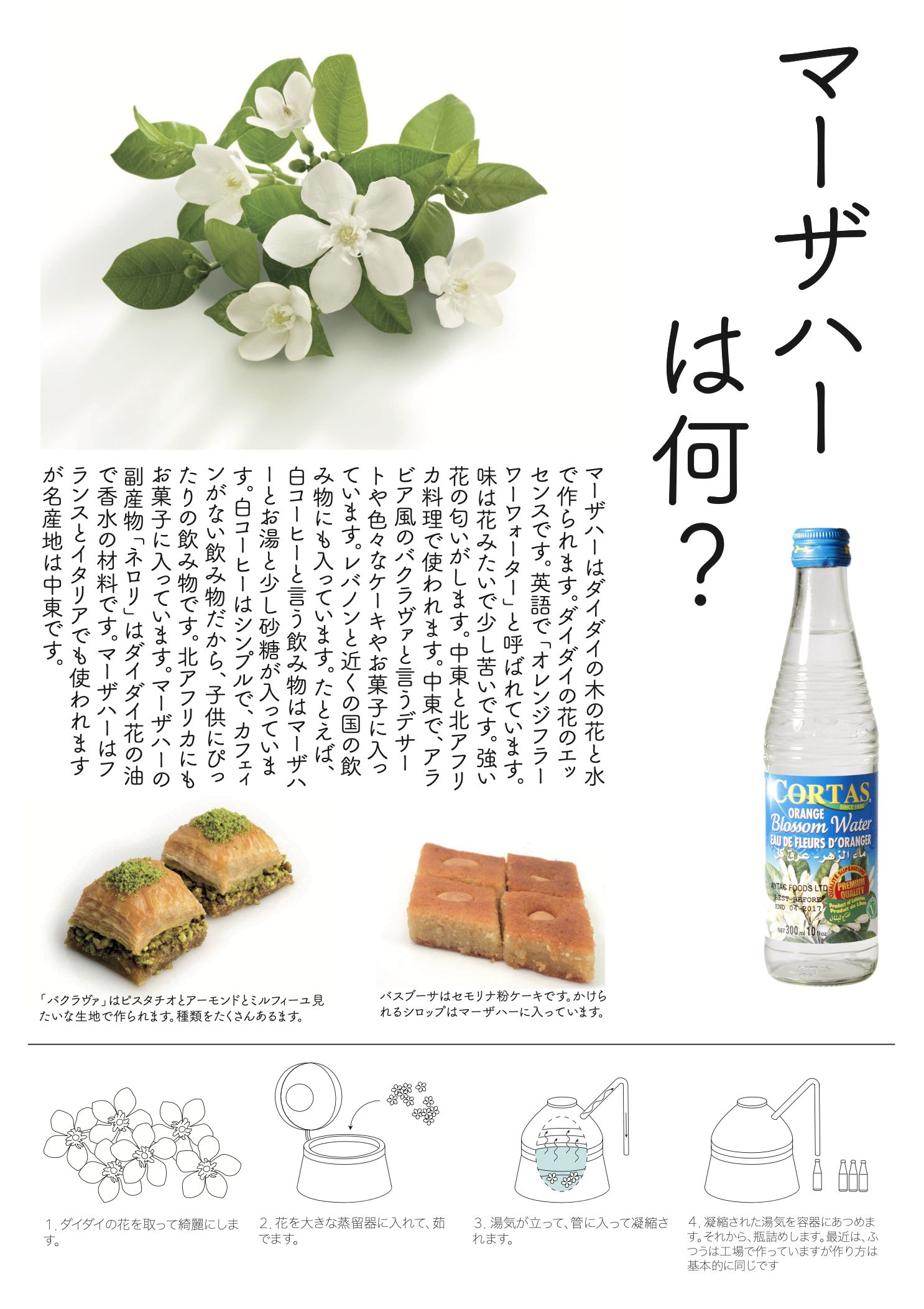
Orange blossom water is a versatile ingredient used in Middle Eastern cuisine. It has a unique, fragrant flavor which is truly delightful. I made this infographic to practice using Illustrator and as a project for a Japanese class I was taking. As a brief caveat, my 2016 Japanese was not what it is today, and that lack of experience probably shows.